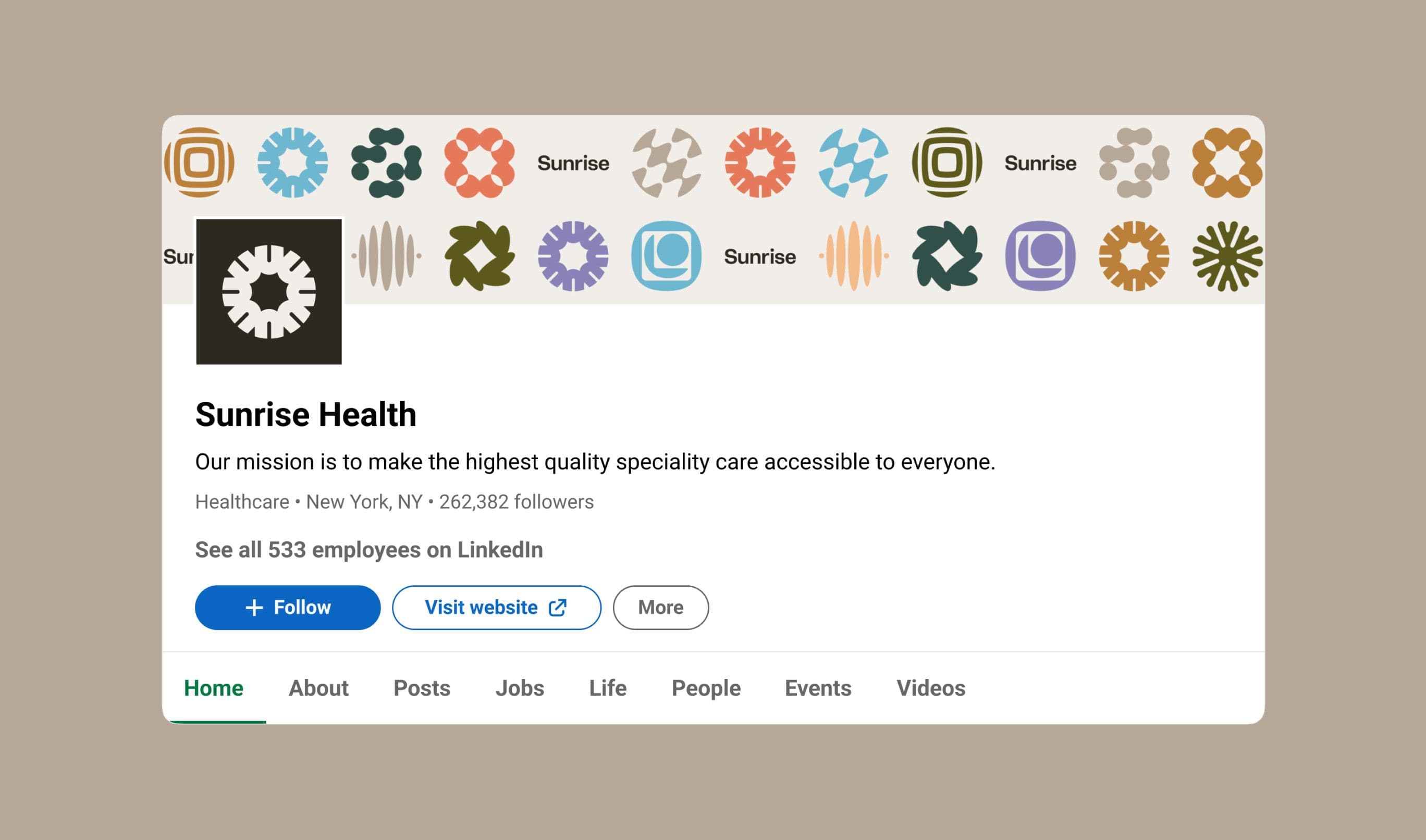
Sunrise Health
Sunrise Health
Expanding access to modern obesity care
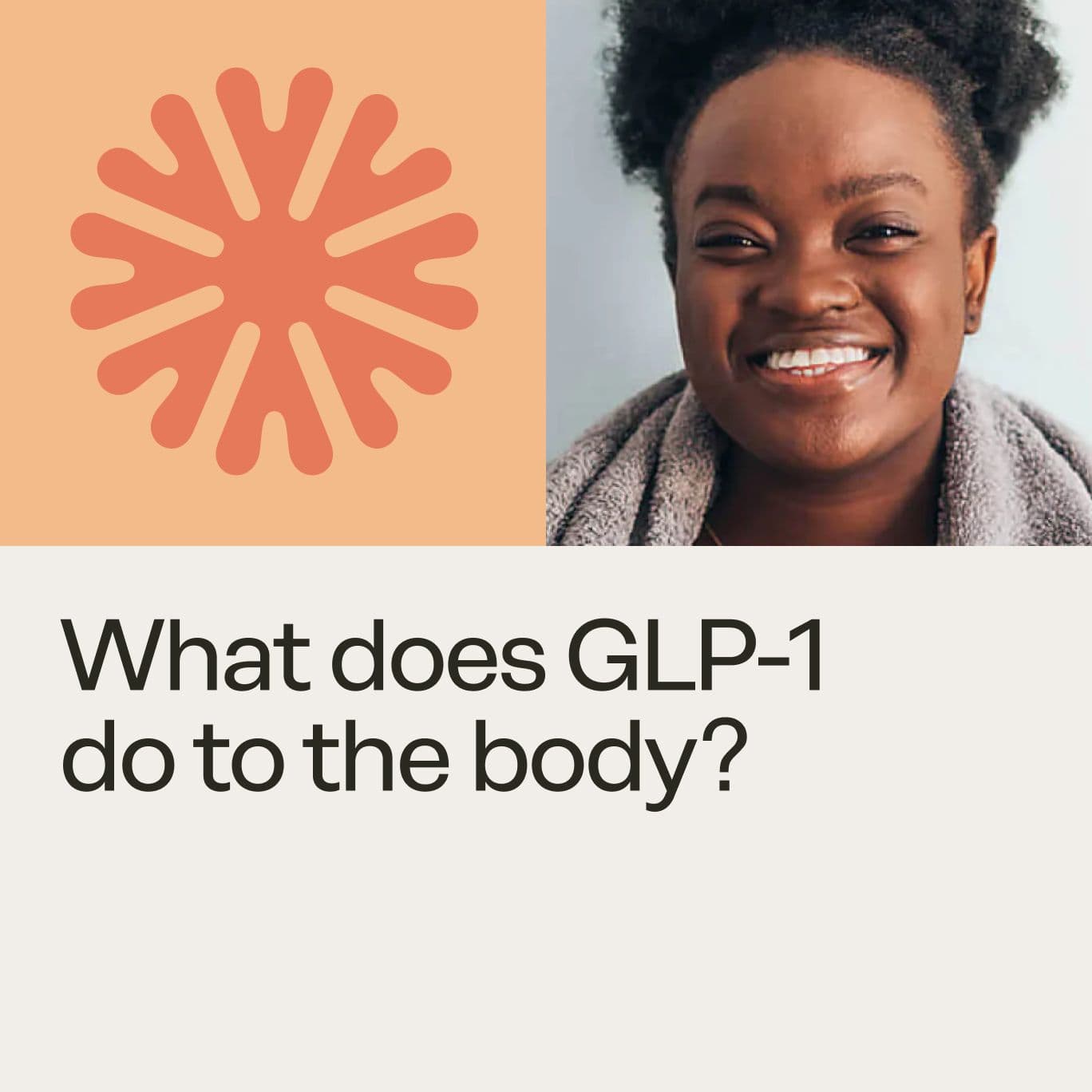
Sunrise Health is a digital healthcare provider focused on making obesity care more accessible and scalable. At the center of their offering is clinically driven weight loss, connecting patients with licensed physicians and, when appropriate, access to medications like GLP-1, one of the most effective and in-demand treatments today.
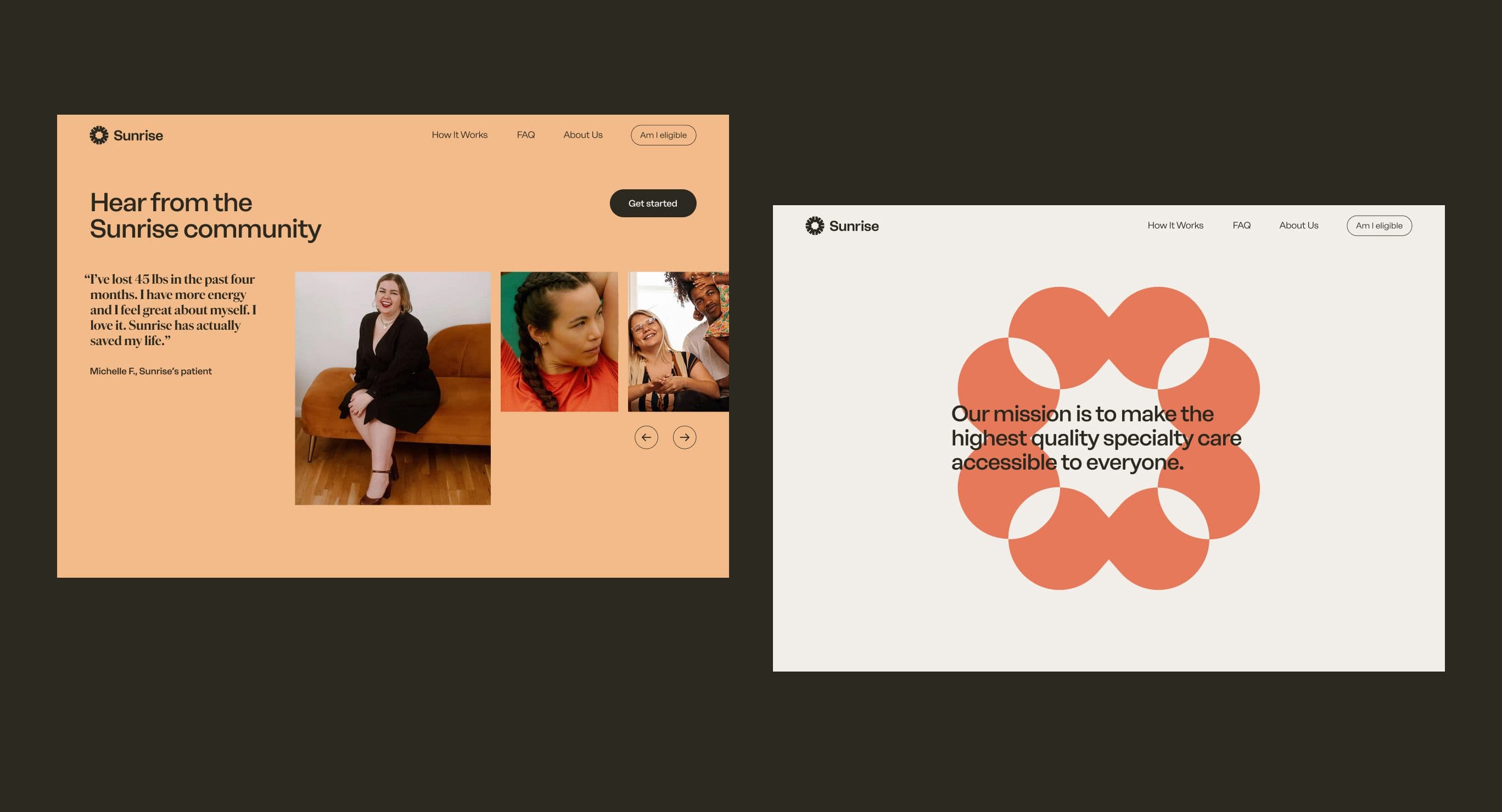
Our role was to translate that ambition into something tangible. We built a brand that brings their values and patient-centric approach to life, grounded in care, trust, and progress. The identity reflects both the strength of a united community and Sunrise’s continuous pursuit of innovation, positioning them not just as a provider, but as a new model for what healthcare can become.
Partnerships

Apoorva Mehta
Founder & CEO
Results
200K+ patients served in the first 2 years
Multi-million dollar annual revenue
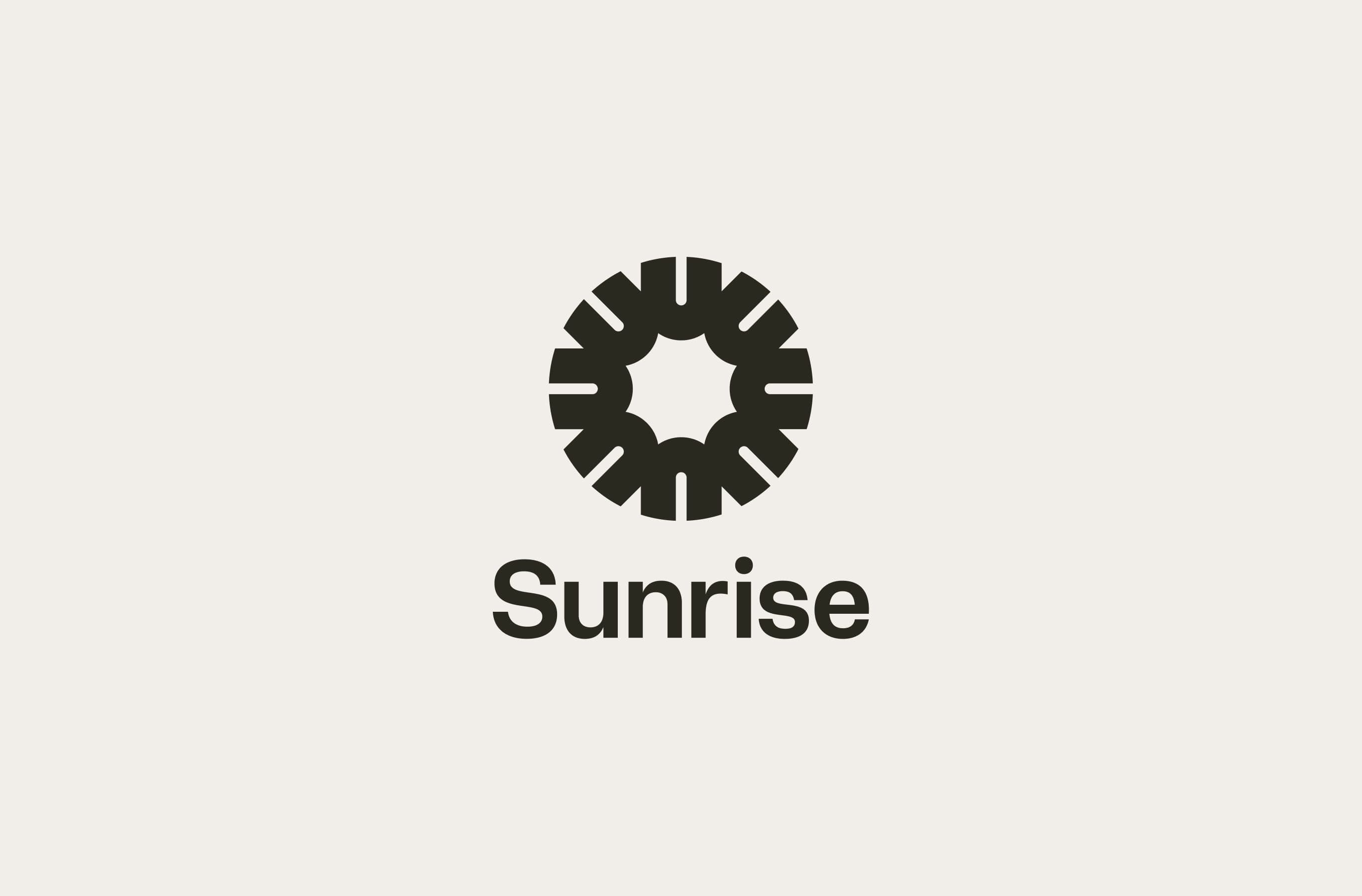

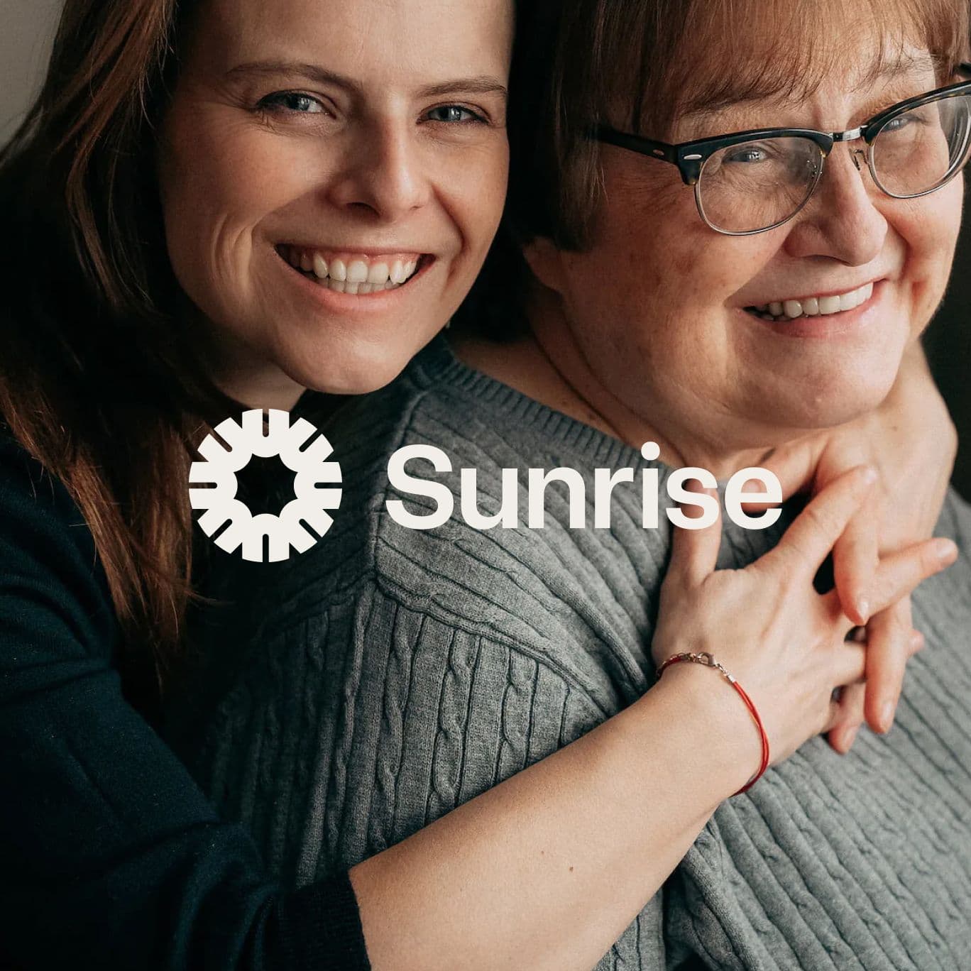
Identity centers around the individuals
The foundation of the Sunrise brand is the emblem, created by an interlocking circle of U shapes. The repeated shape represents individuals coming together in unity, and the energy that emits from the transformative power of that collaboration.
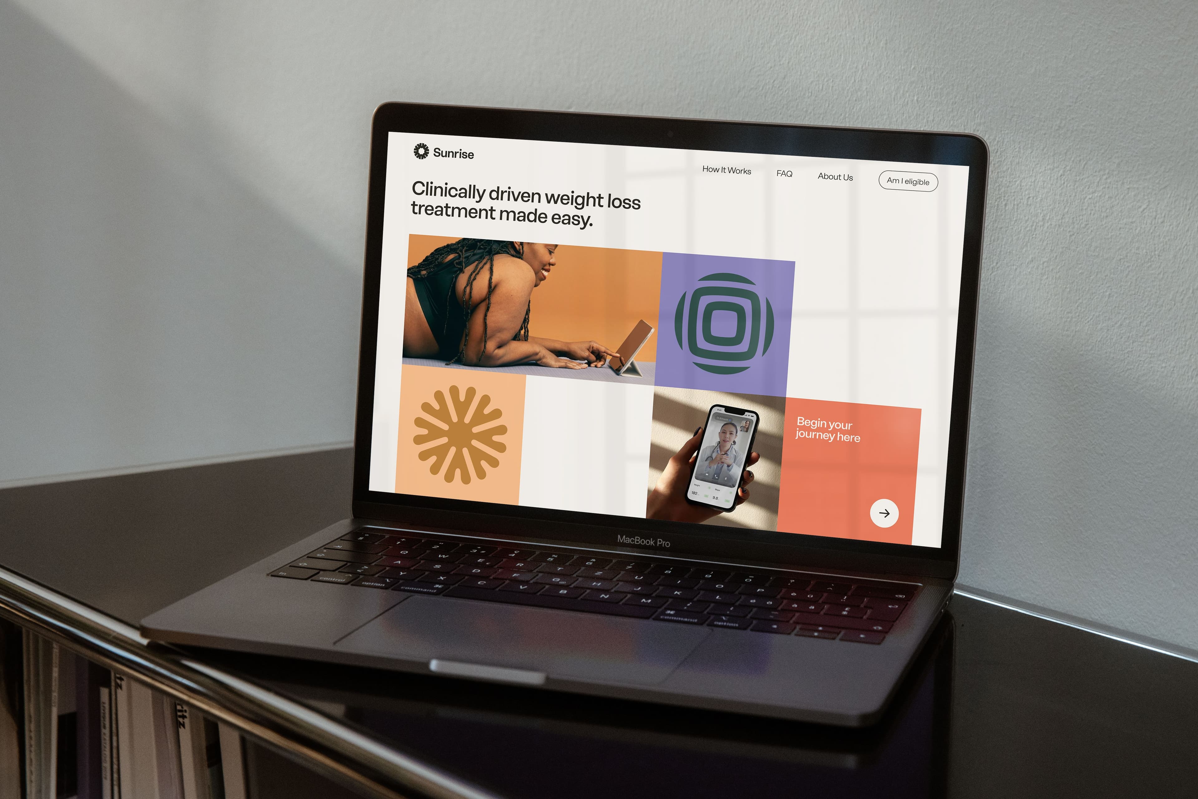
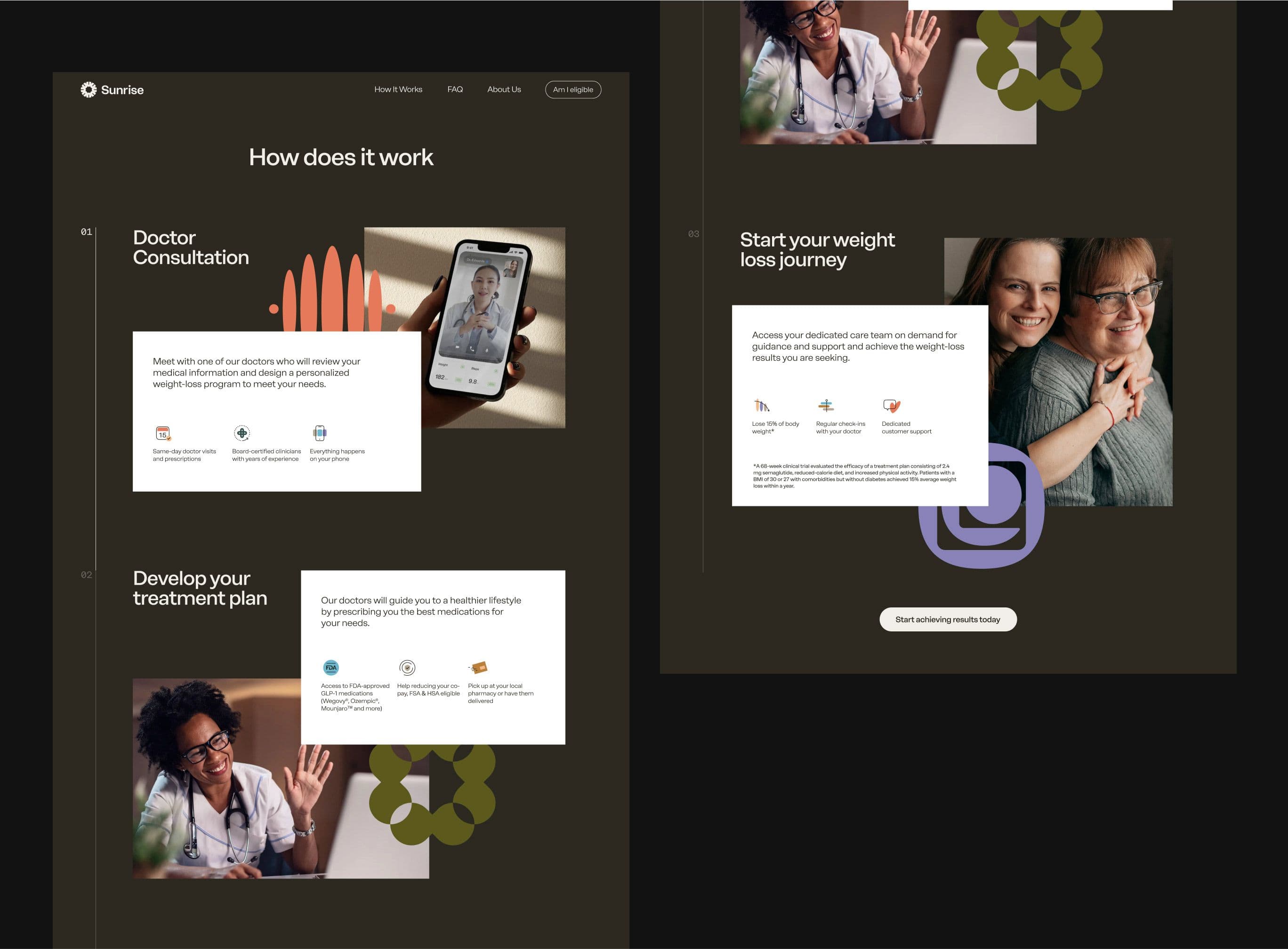
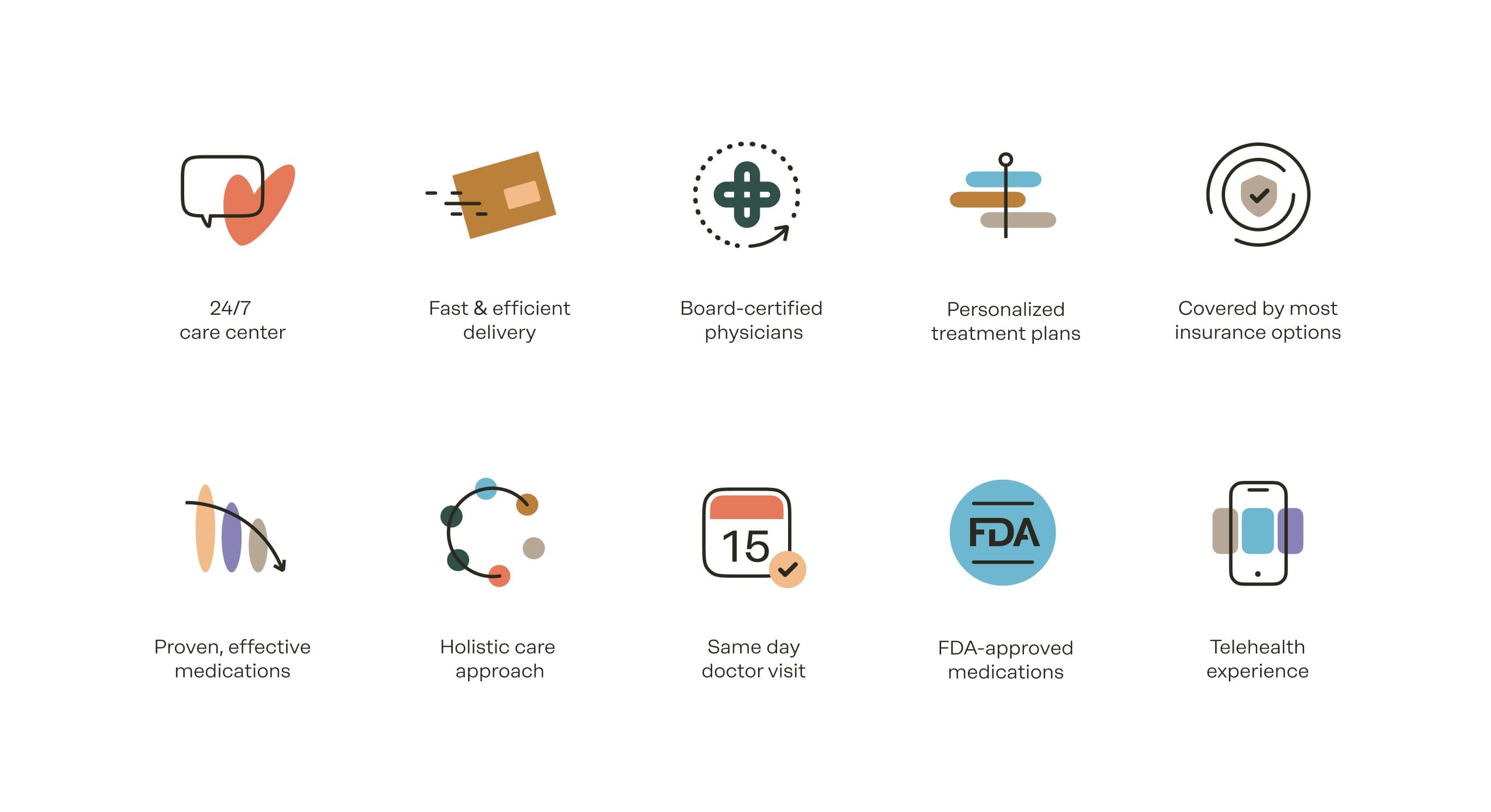
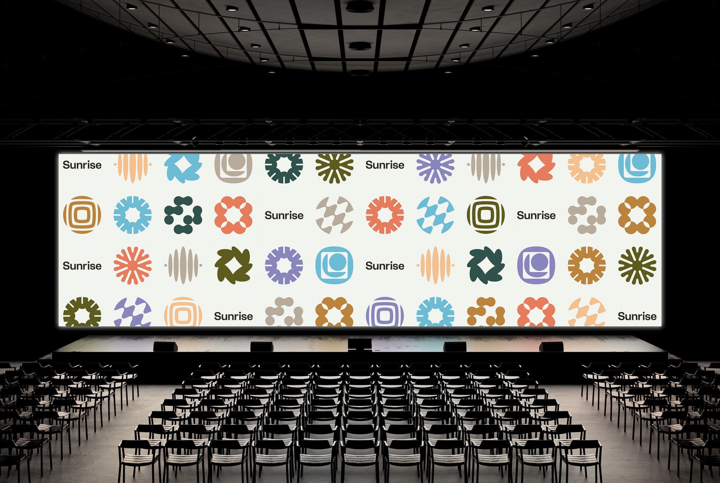
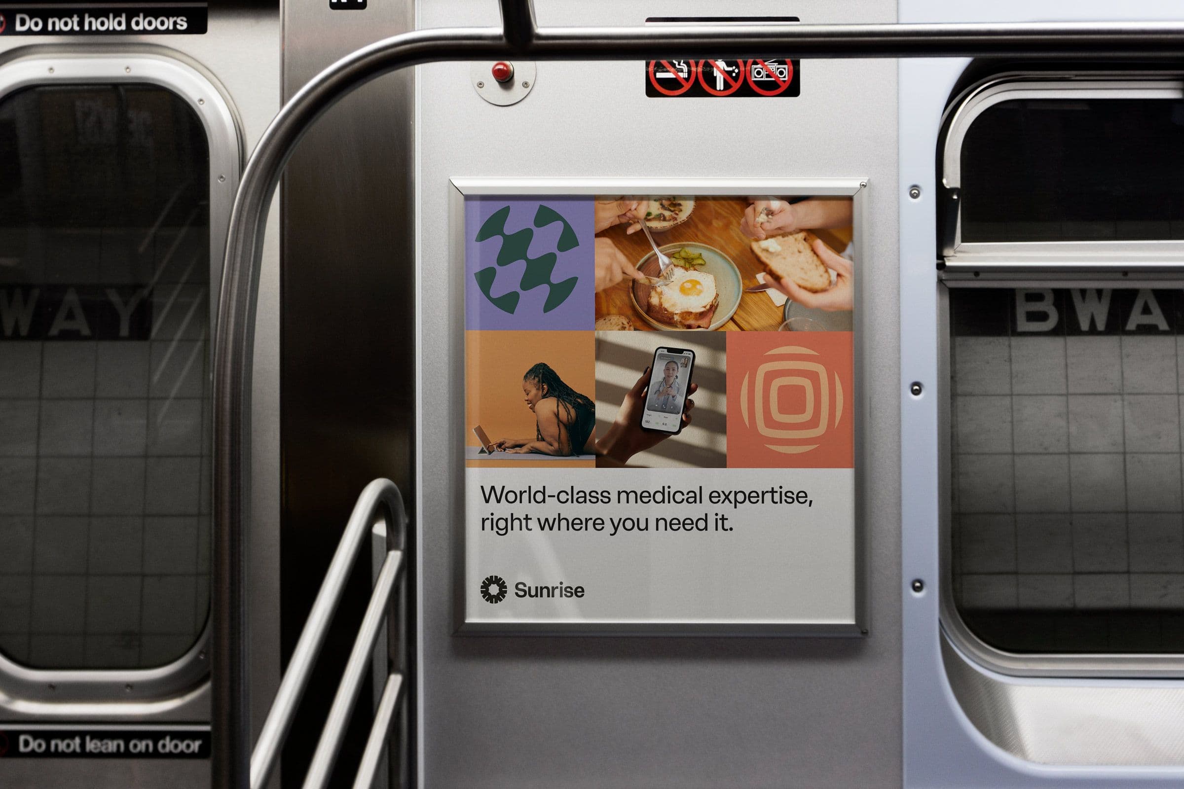
Icons designed to uplift
We developed a suite of illustrative icons originating from geometric shapes. We incorporated a sense of movement and upward motion to add a sense of actionability to the family of icons.

Graphic symbolizes the holistic experience
Another foundation of the Sunrise brand were the symbols developed to parallel the brand's values. Based in geometric shapes, each symbol is mirrored to values like patient-centrism, operational excellence, and impact-driven care. These symbols used in harmony work together to bring the visual metaphor of support and harmony to life.


From Insight to Infrastructure
The launch of Sunrise Health revealed a deeper systems problem: there is no “Stripe for healthcare.” Telehealth companies are forced to navigate fragmented insurance networks, often relying on out-of-pocket payments that limit access. That insight led to Bridge, a one-click insurance checkout that makes accepting insurance as seamless as a credit card.
Today, Bridge carries that original vision forward at the infrastructure level, building a one-click insurance checkout that makes healthcare access seamless by default. What began as a brand for better care became the blueprint for rebuilding the system behind it.
Scope
- Visual Identity
- Website
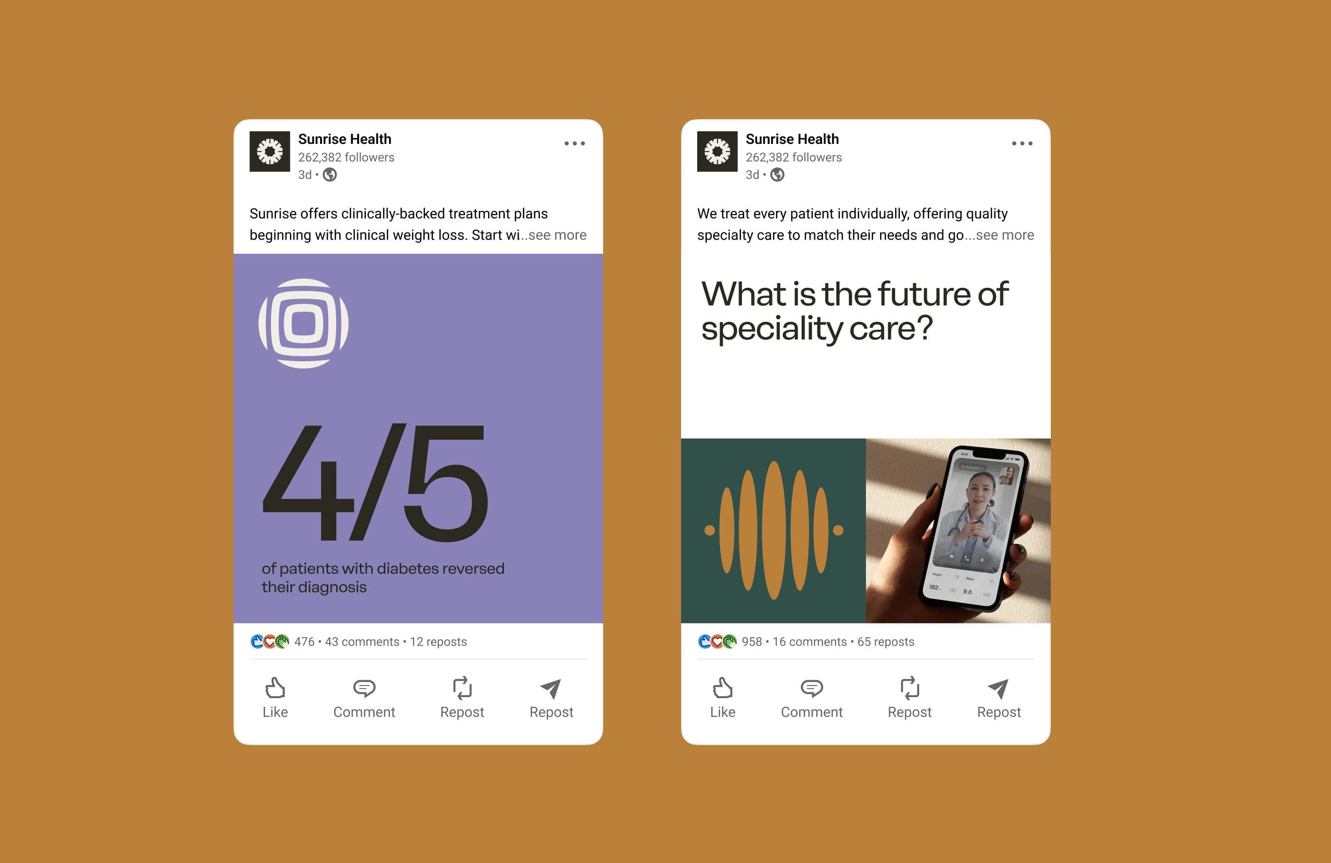
- Social
- Brand Guidelines
Team
Melody Yung, Creative Lead
Alli Berk, Design
Caleb Couturie, Copy
Whitt Mitchell, Design
Yu Rong, Design
Credits
Apoorva Mehta, Founder & CEO
Caitlyn Durcan, Marketing
Jake Horowitz, Marketing
Jacob Gilson, Growth
Daniel Todorov, Product